Above: watch our video guide
Color is obviously a key component in photography, but it’s also a remarkably complex and subtle subject. We’re all attracted by color, but in very different ways at very different times. Color can produce an emotional response, such as the warm colors of an autumnal scene or the bright blue skies of summer. It can also create a strong graphical effect with color contrasts and harmonies.
We all react to color when we take photographs without necessarily realising it, but it can be useful to think about how color works and how we can make the most of it when we’re out taking pictures. For example, more is not always better! A scene packed with every color under the sun, such as an open air market, for example, will not necessarily make a good photograph, and simply turning the color up to maximum either with your Canon EOS camera’s Picture Styles or later in software, will make the colors stronger but won’t necessarily make them better. Colors like to fight for attention, and if you increase the saturation, you’re just increasing the conflict.
It pays to be selective with color, so think about what’s attracting you to a scene, how color is involved and how to make sure that comes across. This can help you decide on the best composition, or what to include and what to leave out, and the best camera settings, particularly white balance which has the effect of making your scenes appear more warm or cool.
Lighting can also have an effect on color. Soft, indirect lighting can often make colors seem richer and stronger, while harsh sunlight and shadows can take away some of their impact.
Below are six different ideas to get you thinking about how you use color in your photographs. A great way to start is to go through your own catalogue of photos and see how they might fit in with these ideas – or whether you have better ones of your own! Either way, it helps build a more subtle understanding of color that will stand you in good stead when you are next out taking pictures.
1. White balance

Your camera's auto white balance system tries to correct color casts in pictures. Instead, select a manual white balance preset (‘Daylight’ is the most neutral) to capture colors as they are and not how the camera thinks they should be!
2. Vivid or natural
Stronger colors aren’t always better. If you are shooting a subtle, delicate subject, bumping up the saturation can spoil the effect. This is why Canon cameras (for example) have ‘Faithful’ and ‘Portrait’ Picture Styles to help keep saturation at realistic levels.
3. Contrasting colors

Color contrasts can work really well. The trick is to choose colors which are opposite, or nearly opposite on the color wheel. For example, blue and orange or yellow combos are often found in beach scenes or city lights shot at dusk.
4. Color harmony

The color wheel is a useful tool for picking out contrasting colors, but it can also show harmonious, or ‘analogous’ colors. These are colors next to each other on the color wheel. Autumnal scenes are a classic example, but you can add harmony to portraits with clothing and props.
5. Single colors

You don’t need more than one color in a photograph! Sunset and dusk are great examples. A sunset may only have a single dominant color or two, but can still make a spectacular image. Also look for subjects with just a single color against white or black for a strong contrast too.
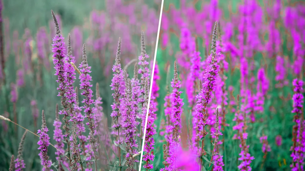
6. Enhancing in software

Instead of using your software’s saturation and vibrance sliders, try its HSL controls instead. These will let you target individual colors to shift their hue, saturation and lightness values to make them work better together, whether it’s to boost color contrast or restore subtlety and harmony.

These are the best cameras for portraits and the best portrait photography tips. You might also like the best photo editing software and the best photo-editing laptops.